Sustainability Graphic - Usage Guide
Download the full Sustainability Graphic Usage Guide.
Logo Lockup VS. Graphic
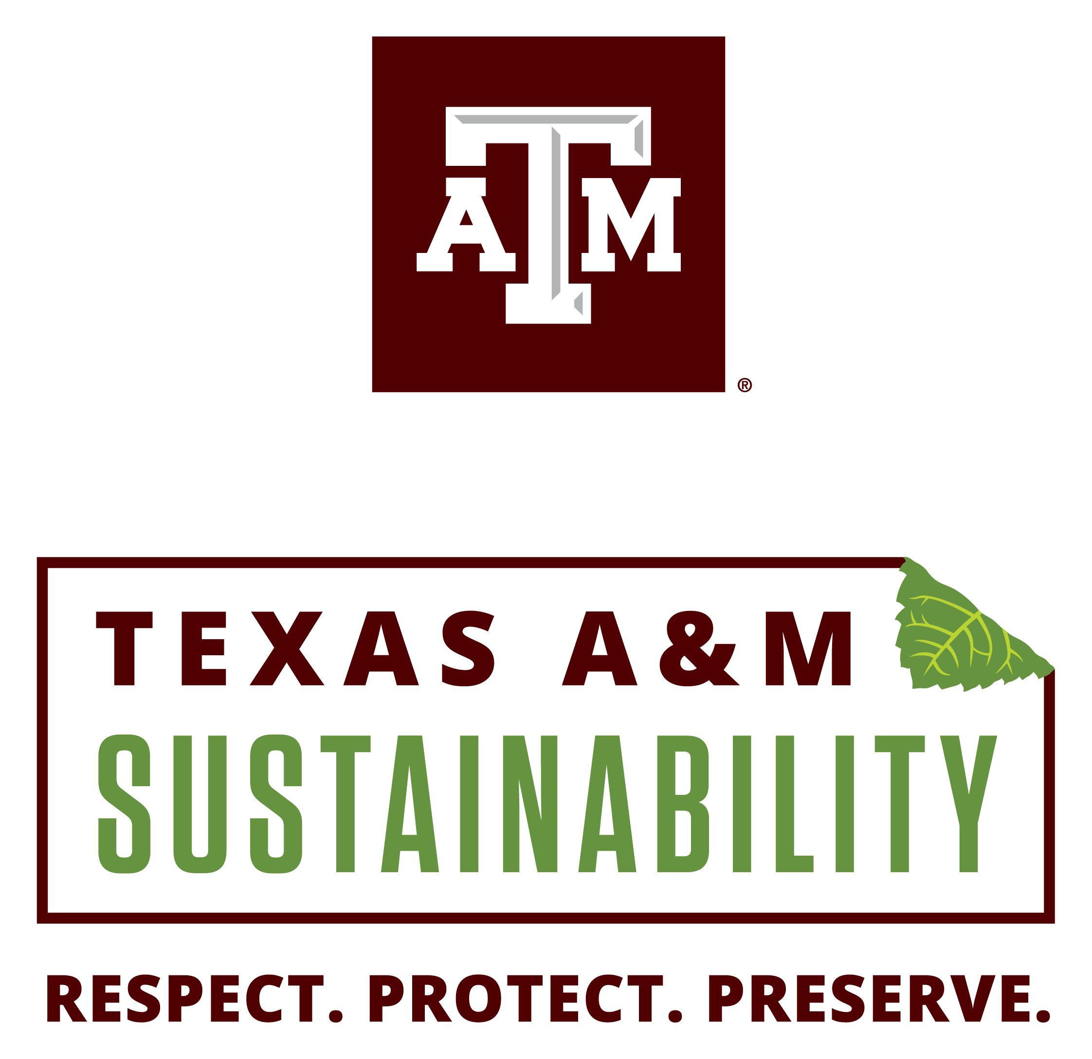
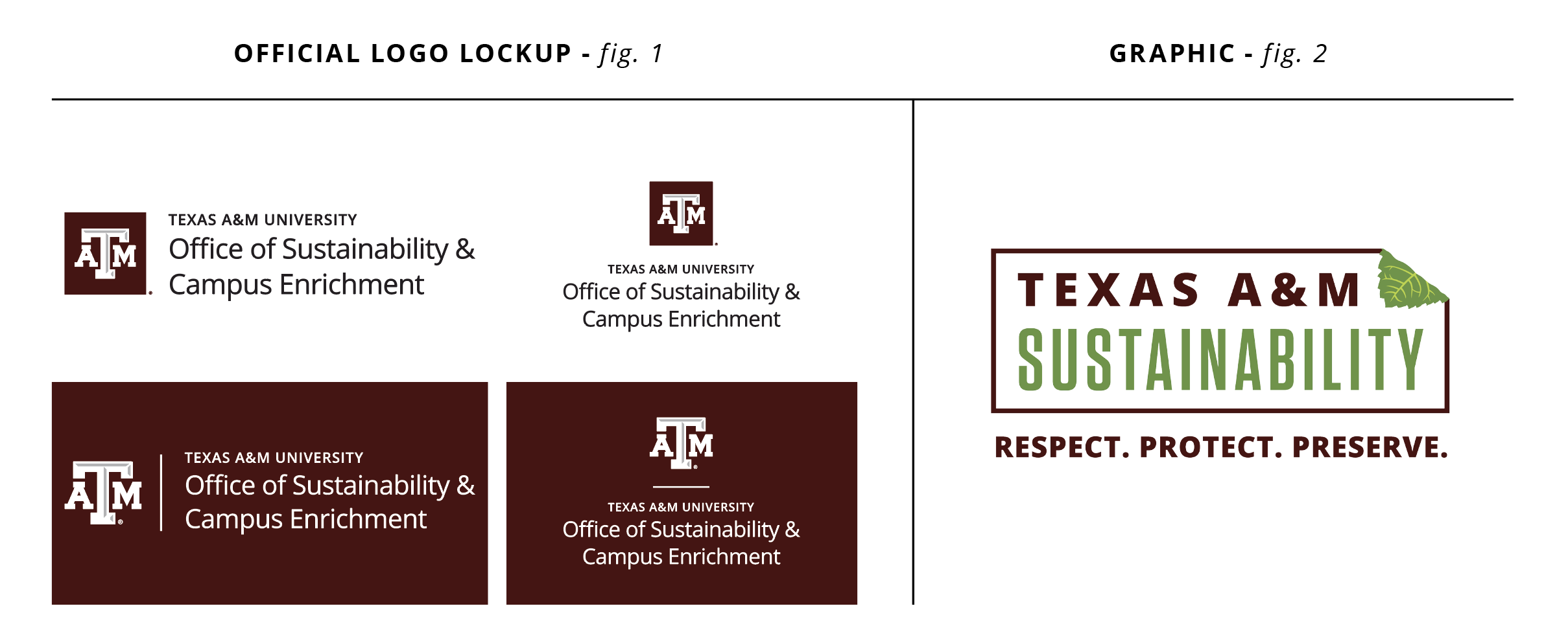
The Texas A&M Office of Sustainability & Campus Enrichment has one primary identifying logo, the official logo lockup (fig. 1). This logo lockup should be used primarily on marketing and communications pieces/channels.
Texas A&M University is a leader in research and education for how we interact with—and impact—our environment. As such, many different entities in our campus community have programs and intiatives that seek out the Office of Sustainability to ensure their work has their official approval.
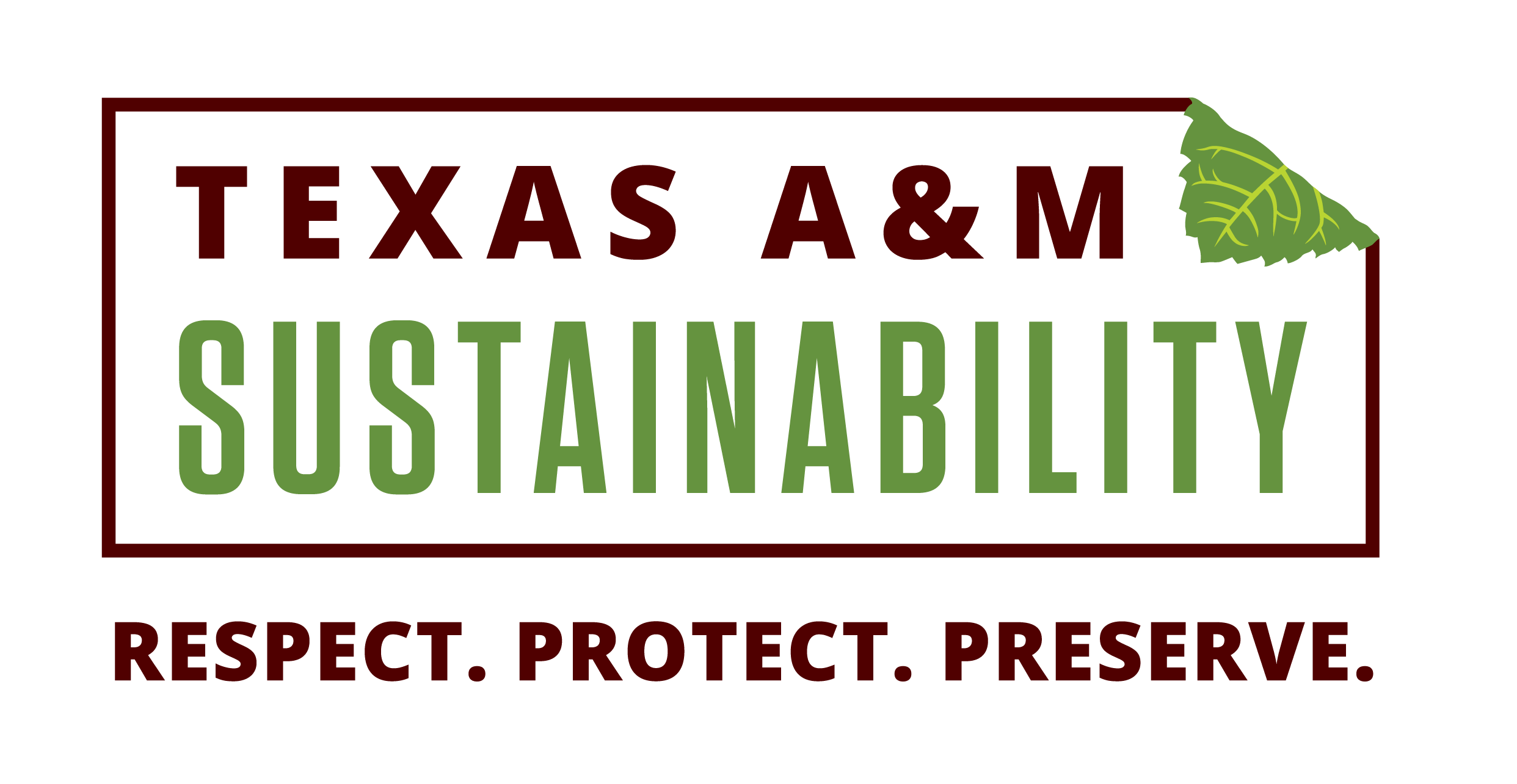
The Office of Sustainability & Campus Enrichment has a promotional graphic (fig. 2) available for broad campus use, for application on any materials related to a general Texas A&M Sustainability initiative or project. This graphic is not to be used as a stand alone logo to represent the Office of Sustainability & Campus Enrichment. The following guide outlines usage for the graphic in various applications.
Graphic Assets
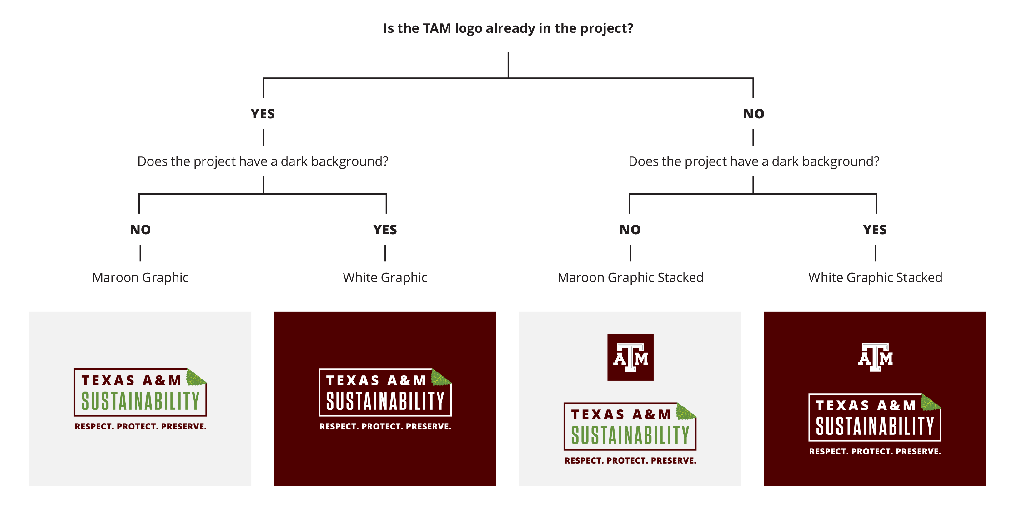
The Office of Sustainability & Campus Enrichment has four versions of the graphic that are available for use. The existing branding of the project will determine which graphic will be implemented.
Usage Guidelines
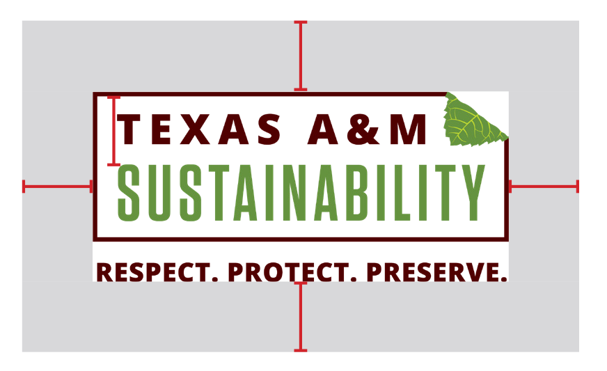
CLEAR SPACE REQUIREMENTS
Leave a clear space around the graphic equal to half the height of the rectangle in the graphic.
MINIMUM SIZE
To ensure the legibility of detail in the graphic, the minimum size it should be unsed in any application is 0.75" in height.
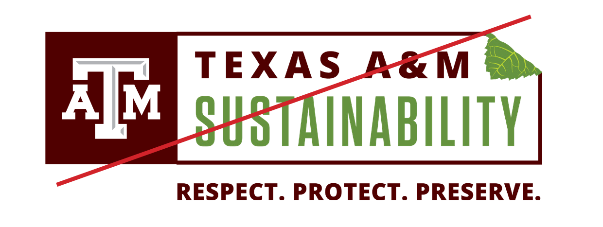
USAGE "DON'TS"
DON'T create a "lockup" combining the TAM logo with the sustainability graphic, or move the Texas A&M box TAM logo closer to the graphic than outlined in this guide. This treatment makes the graphic appear to be an official logo.
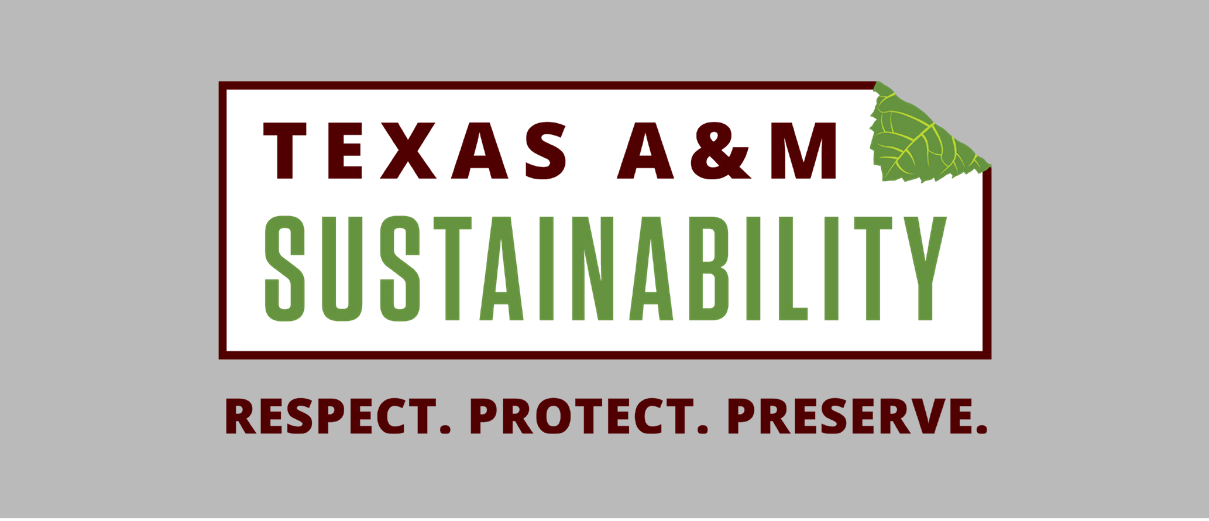
DON'T use the graphic on a colored background in a way that decreases the legibility or contrast of the text colors.

Graphic Color Palette
The colors below are for digital, on-screen materials. Both RGB values and HEX codes have been provided. Every display is different so there may be slight variation across devices.

The colors below are for printed materials. Both CMYK percentages have been provided. Every print technique is different and print proofs are recommended to ensure color accuracy.

Contrast Guidelines
ON WHITE
ON MIDTONE
ON DARK
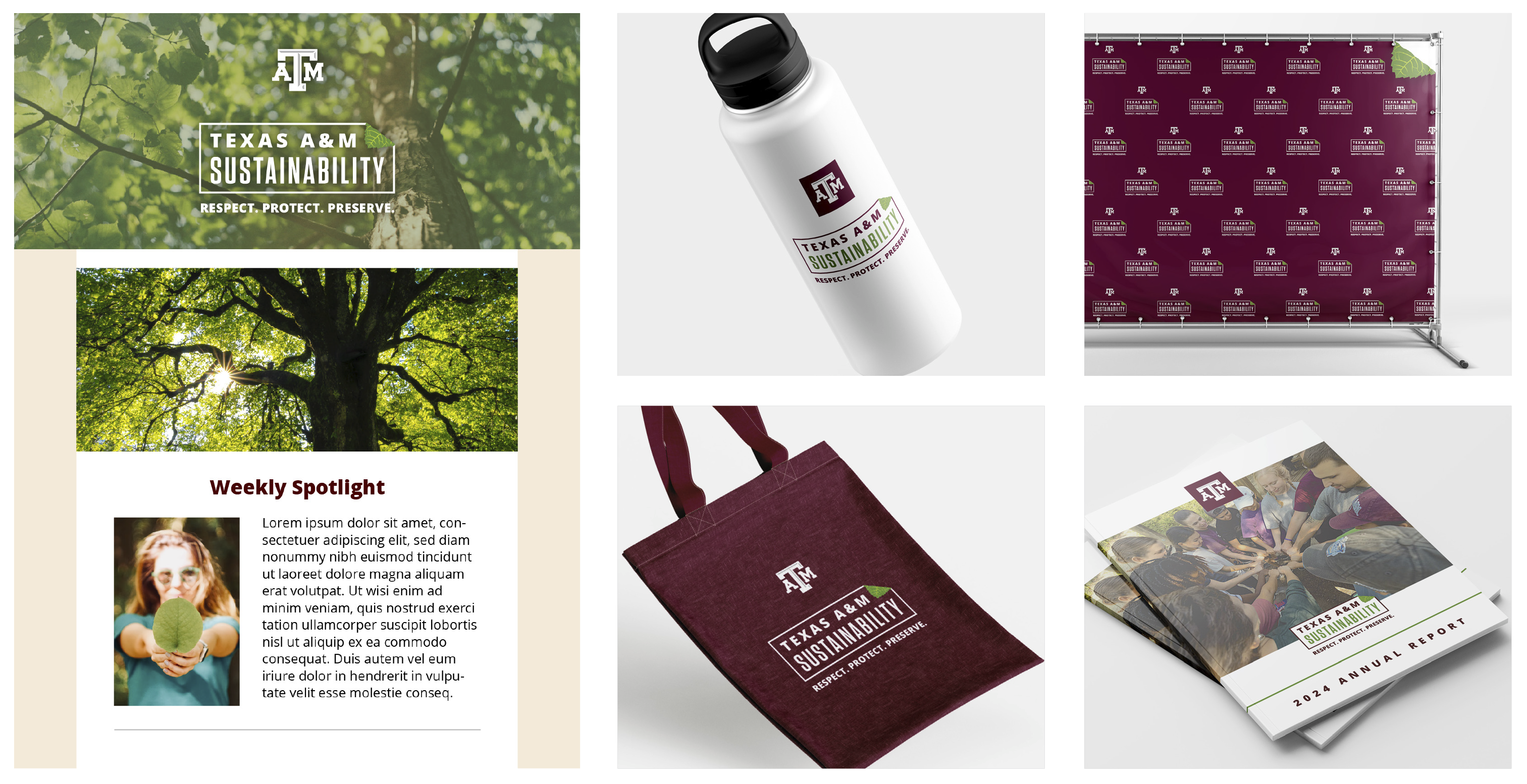
Application Examples
When designing print and digital ads or program flyers the graphic may be used as long as the Texas A&M logo is also used. The graphic is not to be used as a stand alone logo to represent the Office of Sustainability, and must always be used in conjunction with Texas A&M Branding.
